PAUL RAND: DESIGN & THE PLAY INSTINCT
This project required that we design a layout for Paul Rand’s article ‘Design and the Play Instinct’. This is my attempt at putting together a clean, minimal, and easy to read booklet formatted in a 1:1 aspect ratio - the perfect coffee table book.
Cover Page. The 1:1 ratio is echoed here - while an unusual size for print, creating a grid and layout that worked well provided to be a fun design challenge.
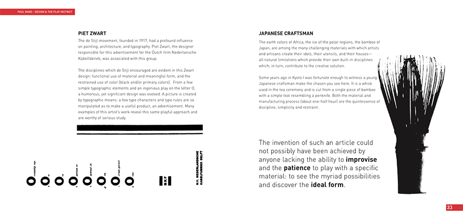
Examples of selected spreads. More often than not, I attempted to cross spreads, rather than contain content to a singular page. The structure of the grid allowed for this flexibility and sense of movement without being too chaotic.
Images are also treated as design elements, interacting with the text in fun and unique ways rather than being static and lifeless.